A little while back I’ve talked about themes and color palettes that are mandatory to create kits with by the store you sell at. Sometimes you are lucky and both the colors and theme appeal to you, but sometimes they do not. That was the case with this theme. ‘Sweetest Dreams’ to me was, well, cheesy. I didn’t like the ‘sweet’ colors that accompanied the theme, with soft and bright pinks, yellow and purples either. It is just not me. Fortunately, we usually get a very large palette to choose from. I did like the green/teal and with that, the yellow was really ok too. It did give a nice contrast. The compulsory kit I made (with the ‘sweet’ colors) is probably one of the kits I’ve made I like the least. I’m not even going to show it here. If you are curious, just look it up in my store. But I really enjoyed making an addon, that eventually became a full page kit. It is not that sweet and lovely, but messy and art journal style and I love it!
You can find this kit here.

Of course I’m not going to leave you without some gorgeous inspiration by the creative team!
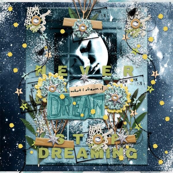
I totally love this amazing page by Rhonda. I feel like I can just touch it! I love the creative details (replacing a flair for the ‘O’ in the word ‘stop’, adding a 3D effect to the word art, etc.).

This layout is by Charlotte. I love the big photo, that is perfect for the theme she chose. The blending is amazing, just like the sun coming in for some positive vibes that fits in perfectly!

This one is by Marianne. I’m always in awe of her amazing photo treatments and blending techniques.

This last one is by Ange. She always makes amazing cards with my designs. I love the two papers used for the background and the flower cluster. Adding the stitch is such a nice detail, don’t you think?

