…so. I got the name. Now I need a logo.
Since I choose (well… like I said in my last post, had to choose a little) the name Pixel Giraffe Design, my first thought was to make a pixelated giraffe. Even though I was quite pleased with the result it was not what I had in mind for a logo. A logo has to be… simple. Recognizable. Smaller maybe. Also, this pixelated giraffe, show on the sliders of the homepage of our website, is not really in the style I usually design stuff. I’m more of a watercolor-artsy-eclectic-with-a-nod-to-life type of girl. This seemed a little to clean and modern to cover my style. I didn’t trash it though, since I liked it and spend quite a few hours on cutting and drawing and… well, it was my little baby. My first logo.
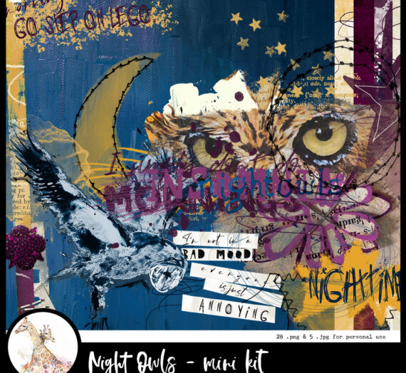
I thought it would still be nice to put somewhere on the website.
Back to the drawing board (not actually a drawing board as you probably know). This new one surely needs some watercolor! I made two giraffes this time. I loved the idea of turning several of the spots in all kind of colors and ‘leaking’ those colors over the rest of drawing. It was definately more my kind of style. Watercolor: check. Artsy: check. Eclectic: check. Putting a little smile on my face: Check. But it is not really a simple, clean logo. But well… maybe I’m just not simple. I really liked the result so I was good to go.
I spend the next hour looking for a nice font to add my company name to the logo I’d just made. Playing around with several fonts (Would I use Capitals or lowercase? Lots of swirls or just something plain and simple? Bold or really thin?) it suddenly struck me how, in the well known Times New Roman font the serif on the ‘g’ kinda looks like ossicones of a giraffe (and, by the way, no… I didn’t know those horn-like structures on a giraffe’s head are called ossicones either, until I googled it 😉 ). I played around a bit, making the serif more prominent but wasn’t quite satisfied with the result. I decided to draw ossicones myself. Yes! That is what I had in mind. This looked like a fun, simple and professionally looking logo. I finally went for another G since I liked a little bit more roundness and I decided to add some ears too. It wasn’t even that much work. The other two drawings I made took me hours, this was done within the hour.
I really feel like a professional now. I got the name. I got the logos.
Now I’m off to make a preview for the scrapping kits I’ll hope to offer soon and I’m pretty sure the last two logos will appear on them 🙂